
MIXLife Brand Aesthetic
BRANDING \ DIGITAL
CLIENT \ MIXLife
In Collaboration with Richard Kappel, Founder and CEO
When I began working with MIXLife the brand needed a visual consistency. I took the logo, color palette, and typefaces from the Web team’s UI Kit to develop a visual vocabulary that would tie the brand together across a variety channels. I developed this aesthetic in real-time as I designed each piece of content in the ever changing environment of a startup.
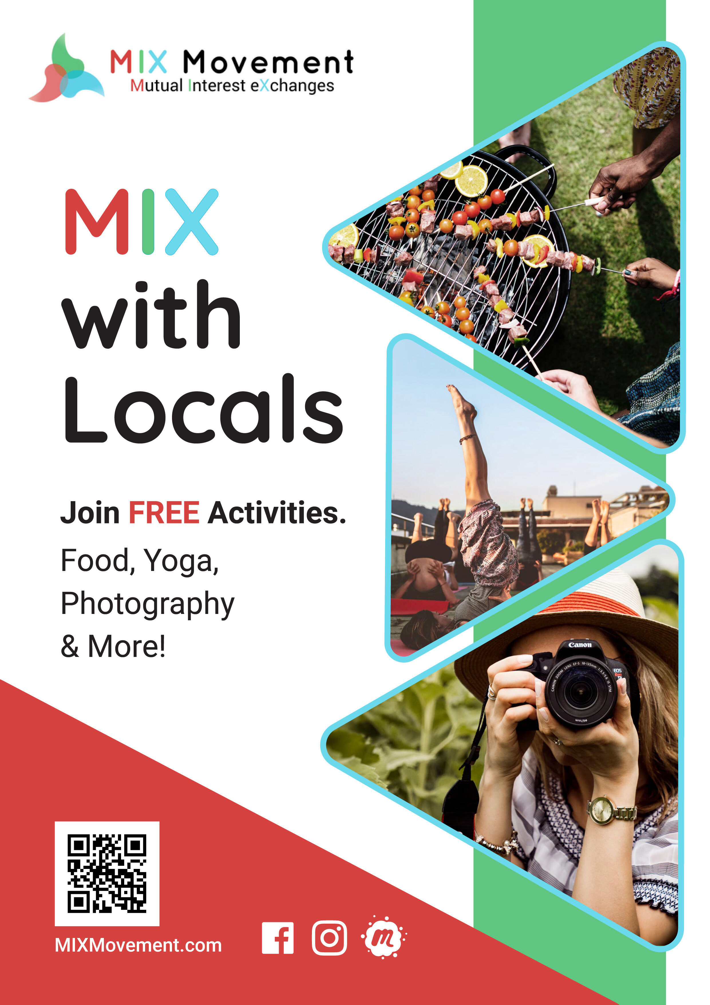
MIXLife is a social enterprise startup based in Lisbon, Portugal. Their focus is on creating cross cultural acceptance and tolerance through shared activities (called MIXs) between travelers and locals.

Because MIX participants come from many cultures, countries and languages I chose imagery and icons that are very representative.
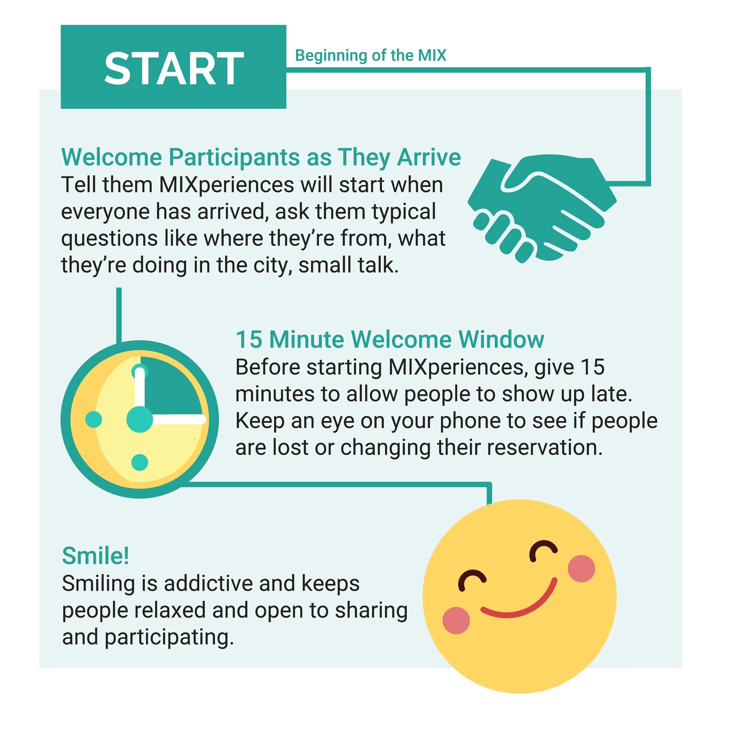
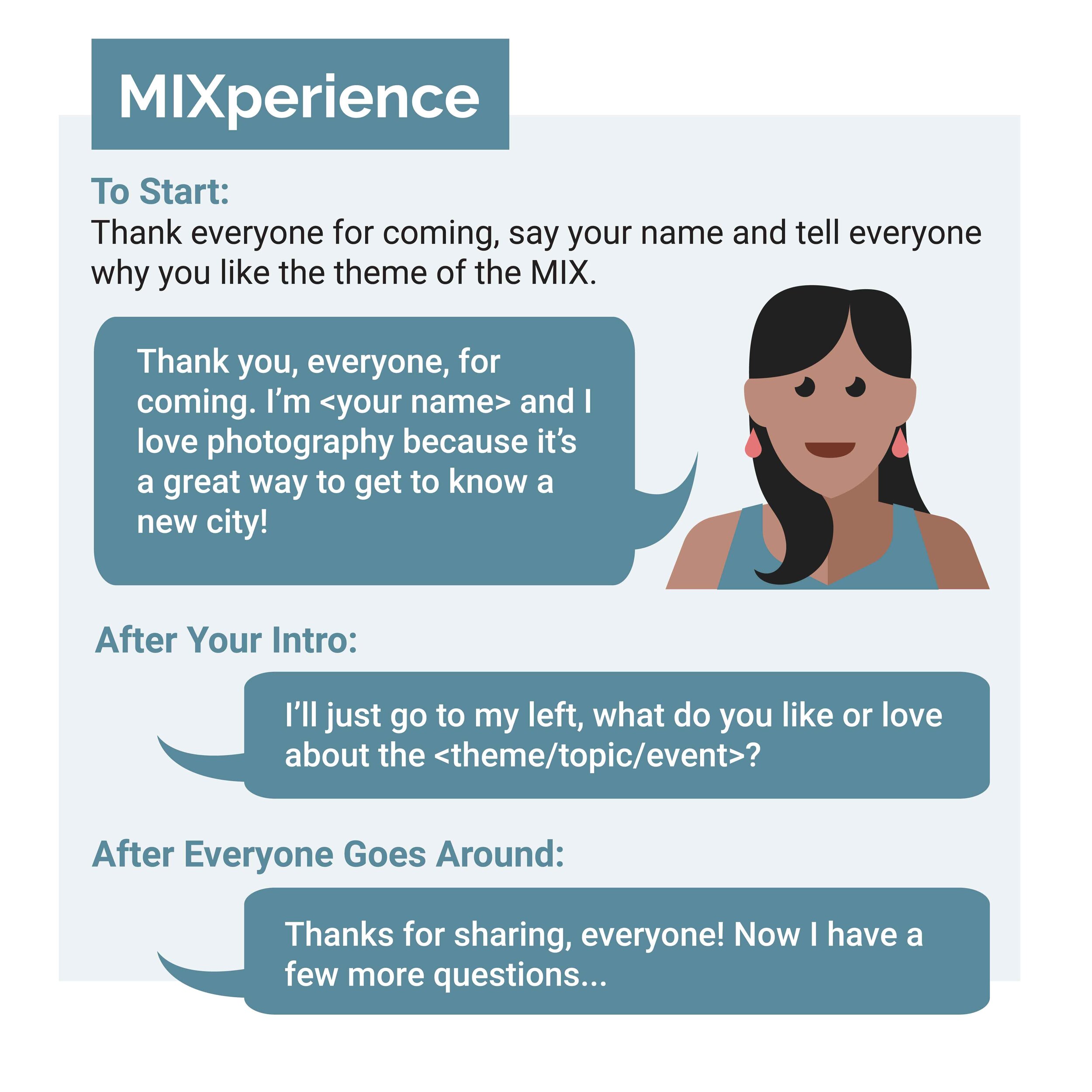
As a first project I created a series of infographics to explain key concepts of MIXLife; what it is and how it works. I used the brand colors and experimented with photographic and iconic imagery.
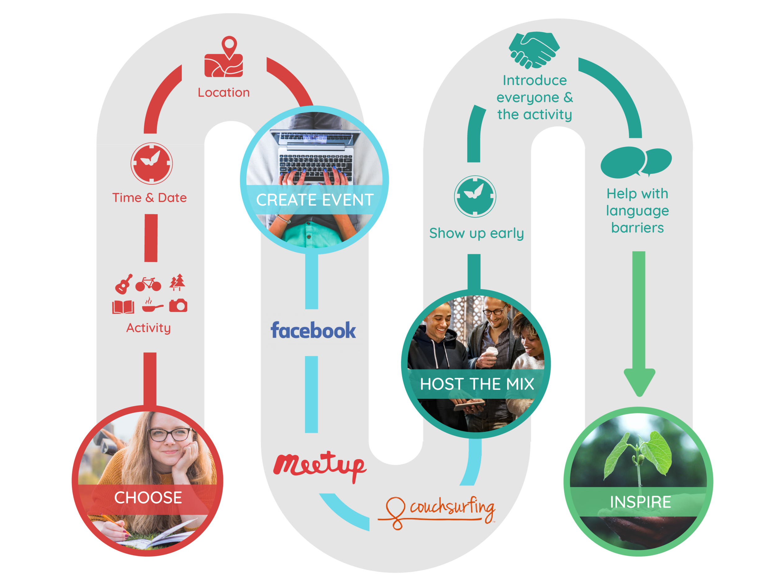
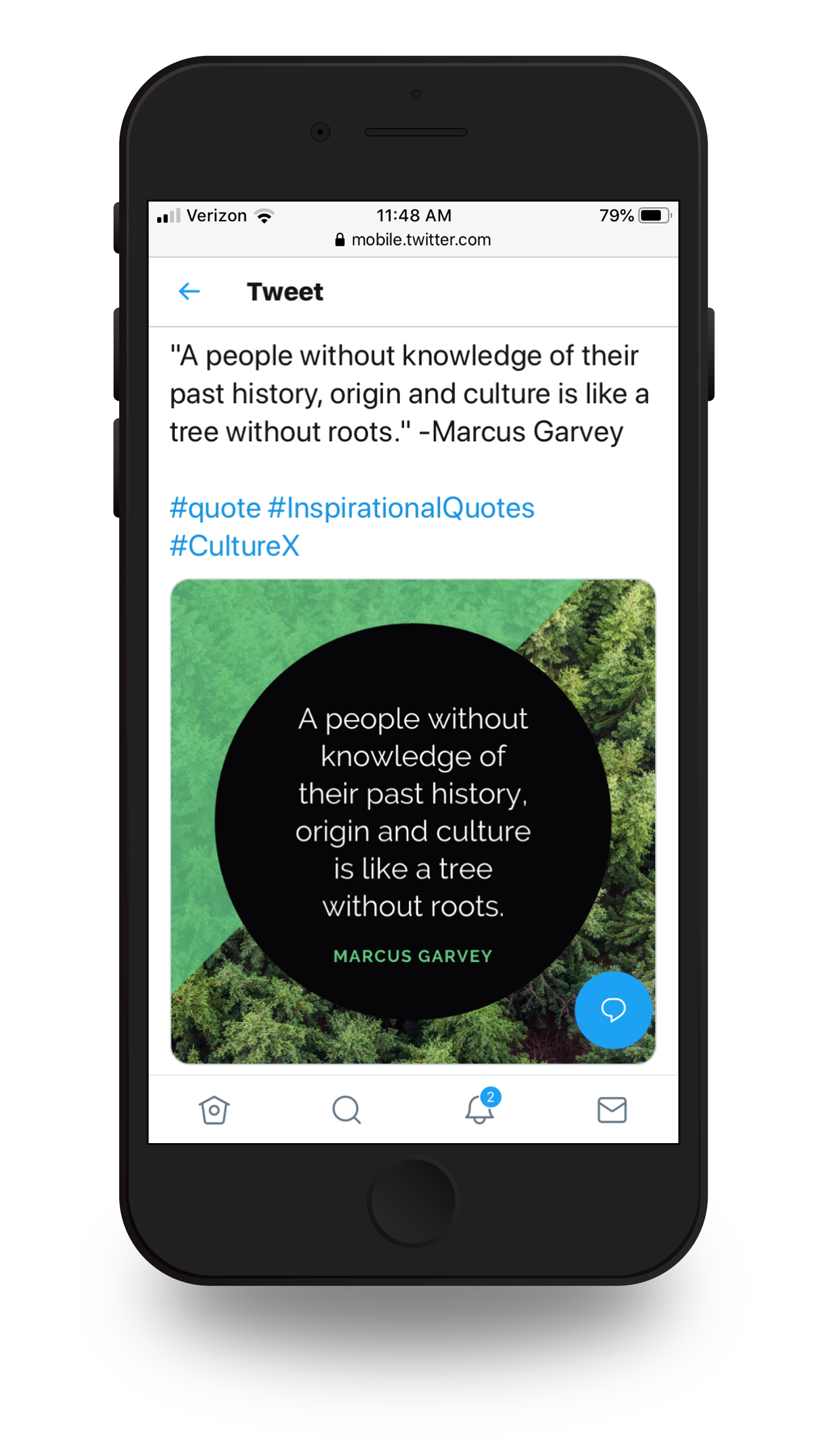
These printable flyers were meant to hang in hostels or community centers, but with MIX participants spread across cities in Europe, printed matter was not an effective way to spread awareness. Instead we decided to focus on digital assets and build an online community.


The flyers were made before the name changed to MIXLife and before we dropped Quicksand from the typographic system.

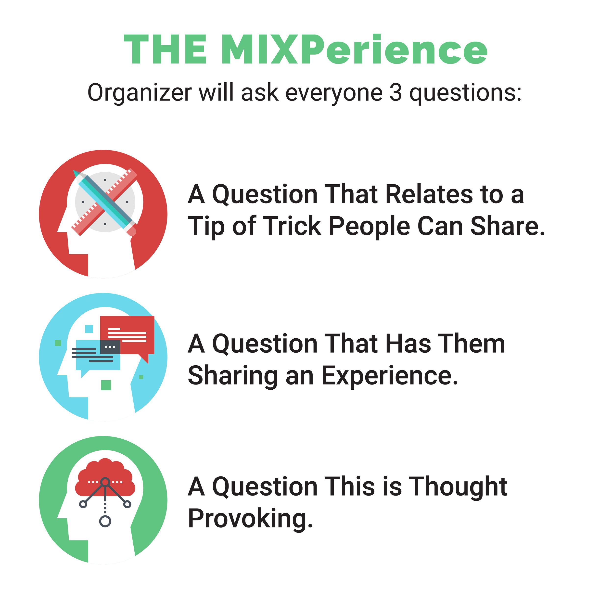
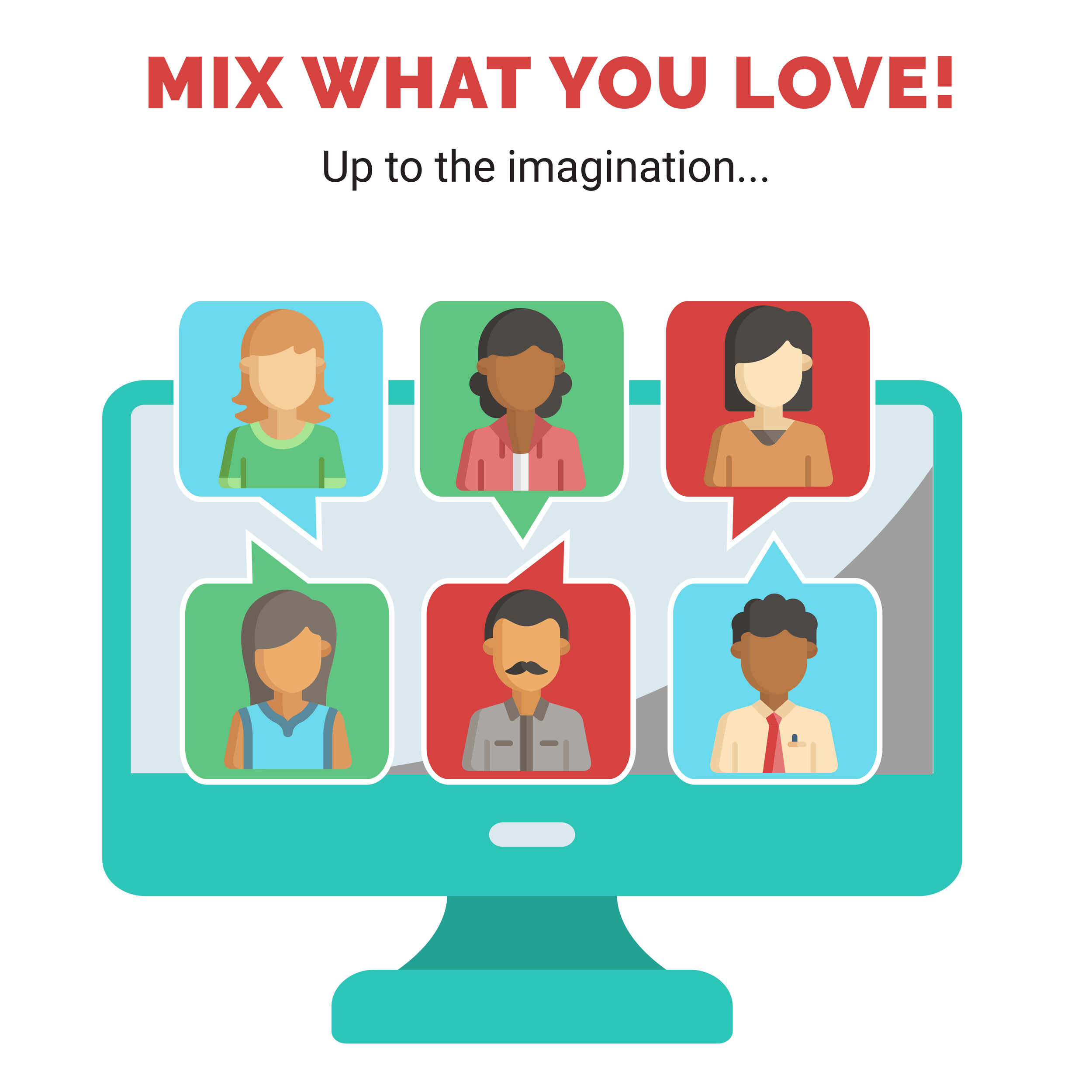
Time and resources were limited so I made use of the Flaticon website to curate a library of graphic assets.
I changed the colors of the icons to reflect MIXLife branding. I also combined or modified many of them to create unique graphics to illustrate MIXLife concepts and messages. The graphics were used as informational assets on the website and as social media posts.